How To Combine Different Wood Tones In One Room
A room with several timber finishes can feel layered, warm and collected rather than mismatched. The secret is to create a relationship between the grains, colours and shapes, so each piece has a place within the overall scheme. This approach works particularly well in open-plan Australian homes, where living, dining and kitchen furniture often share one visual space.
Different wood tones add depth to neutral interiors, soften modern furniture and bring character to a room filled with hard surfaces. Pale oak, honey-toned timber, walnut, black-stained wood and reddish Australian hardwoods can sit together successfully when their proportions and undertones are considered.
The aim is not to make every timber item match. A coordinated interior usually includes one leading wood colour, one supporting tone and perhaps a darker accent. Repeating those tones through furniture, lighting, flooring and accessories creates a deliberate look.
Start With A Timber Colour Map
Before buying another chair or side table, identify the wood finishes already present. Look at the floor, skirting boards, doors, window frames, cabinetry and large furniture. Note whether each surface appears pale, golden, reddish, grey-brown or near-black, and check how it changes in morning and afternoon light.
A simple colour map prevents accidental competition. If the flooring is a strong honey-toned spotted gum, for example, a large orange-toned dining table may make the room feel overly warm. A washed oak, smoked walnut or painted finish could provide better contrast while allowing the existing floor to remain the foundation.
Grain direction matters as much as colour. Several highly figured surfaces can make a compact room look busy, whereas a plain-grained table beside a more expressive timber floor often feels calmer. Consider sheen too: matte finishes tend to blend, while glossy surfaces draw attention.
Choose One Dominant Wood
Most successful rooms have a dominant timber that occupies the greatest visual area. It may be the flooring, a built-in cabinet, a dining suite or a substantial coffee table. Let this main finish establish the mood, then use other woods in smaller quantities.
A pale dominant timber gives a light Scandinavian or coastal impression, while walnut and dark-stained wood create a richer, more formal atmosphere. In a Melbourne terrace with limited natural light, medium or pale timber can keep the room open. In a bright Brisbane or Perth interior, deeper wood tones can add welcome weight.
Use a second finish for contrast rather than trying to divide the room into equal portions. A dark console against pale floors, or a light occasional table beside a deep brown sofa, creates definition. Equal amounts of competing timber can make the scheme feel accidental.
Balance Warm And Cool Undertones
Wood tones are easier to combine when their undertones are understood. Golden oak, honey pine and many reddish hardwoods feel warm. Ash, pale beech and grey-washed finishes can read cooler, while walnut often sits between warm and neutral depending on its stain.
Warm and cool timber can share a room when a bridge colour connects them. Upholstery in oatmeal, mushroom, olive, terracotta or charcoal can soften the transition. A rug containing both tan and grey threads is especially useful because it visually gathers separate furniture finishes.
Avoid judging samples under harsh retail lighting. Bring timber swatches home and view them beside the floor, sofa fabric and wall colour. Australian sunlight can be strong and directional, particularly in north-facing rooms, so a finish that seems subtle in a showroom may appear much more yellow or red at home.
Repeat Tones Through Furniture And Decor
Repetition makes varied furniture feel intentional. If a room includes a dark timber cabinet, echo that tone in a picture frame, lamp base or chair detail. If the main table is pale oak, a small oak stool or timber serving board can quietly reinforce it without creating a matching furniture set.
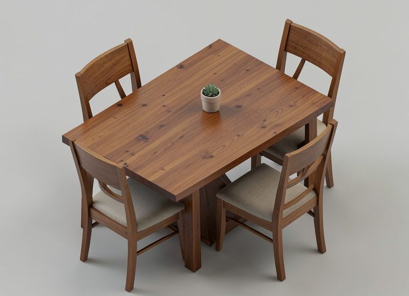
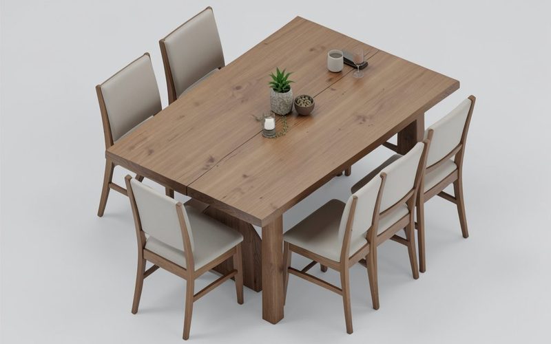
Shape can provide another point of connection. A rounded walnut coffee table may relate to a curved timber-framed chair, even when their colours differ. In a dining area, a rustic surface can work beautifully with contemporary seating when the proportions remain balanced; this farmhouse table guide offers useful context for judging chunky legs, plank character and overall scale.
Keep repeated accents spaced around the room. Placing every dark wood object on one wall creates a heavy block, while distributing small echoes across the seating, dining and entry zones makes the whole interior feel connected.
Use Rugs Lighting And Upholstery
A rug is one of the easiest ways to mediate between contrasting timber finishes. Choose a pattern with at least two of the room’s wood-related colours, then position enough furniture on it to make the seating area feel unified. Flatweave styles suit relaxed coastal rooms, while a low-pile patterned rug can bring definition to a formal setting.
Lighting also affects perceived timber colour. Warm globe bulbs can intensify yellow and red undertones, while neutral-white bulbs show grain more accurately. In Australia, layered lighting is valuable because a room may shift from bright midday sun to subdued evening illumination. Combine ceiling lights with floor lamps, table lamps and wall lighting so the furniture does not look disconnected after dark.
Upholstery acts as visual breathing space between timber surfaces. Linen-look fabric, leather, boucle and cotton can all break up a sequence of wooden legs and tabletops. Neutral upholstery is flexible, but a considered colour such as eucalyptus green, navy or clay can make mixed timber feel more designed.
Plan For Australian Homes
Australian interiors often combine indoor and outdoor living, so timber choices need to work with practical conditions. A home near the coast may experience salty air, sand and strong UV exposure, while a Queenslander or breezy beach house may favour lighter finishes that complement rattan, cane and natural stone. Use durable protective coatings where sunlight reaches furniture for much of the day.
Open-plan layouts are common in new builds around Sydney, Adelaide and regional growth areas, making furniture placement important. Repeat one timber tone between the living and dining zones to maintain flow, then use a contrasting finish to define each function. A dark coffee table can anchor the lounge while a lighter dining table keeps the adjoining kitchen visually fresh.
The local furniture market also includes abundant recycled timber, plantation-grown pine, Australian hardwood and imported oak. Reclaimed boards may have knots, nail marks and uneven colouring, so treat them as a feature rather than expecting them to match factory-finished pieces. In a rental, removable rugs, lamps and small occasional furniture can introduce tonal variety without changing fixed cabinetry or floors.
A Practical Mixing Checklist
Work from the largest surfaces to the smallest details. Flooring and built-ins deserve the most attention, followed by sofas, dining tables and cabinets. Small accessories should support the scheme rather than compensate for furniture that clashes in scale or undertone.
Before committing to a purchase, view the room from its main sightlines. Check the effect from the entry, sofa and dining chairs, because a timber combination that looks balanced close up may appear crowded across an open-plan space.
Use these design checks before adding another timber piece:
- Choose one dominant wood for the largest visual area.
- Limit the room to two or three main timber families.
- Repeat secondary tones at least twice in different zones.
- Mix grain patterns carefully so the eye has a resting place.
- Compare samples in both daylight and evening lamp light.
These styling moves can help unify a varied collection:
- Add a rug that contains two related timber colours.
- Use upholstery in linen, wool, leather or textured cotton as a buffer.
- Echo dark wood in frames, lamp bases or decorative objects.
- Pair rustic timber with cleaner-lined furniture for contrast.
- Keep timber accessories distributed rather than grouped together.
| Wood Combination | Overall Effect | Useful Supporting Colours | Best Placement |
|---|---|---|---|
| Pale oak and walnut | Light with sophisticated contrast | Cream, charcoal, olive | Living or dining rooms |
| Honey pine and whitewashed timber | Casual and coastal | Sand, blue-grey, soft green | Beach houses and relaxed homes |
| Spotted gum and black-stained wood | Strong and contemporary | Off-white, tan, rust | Open-plan modern interiors |
| Reclaimed timber and painted furniture | Characterful and informal | Clay, sage, navy | Farmhouse or eclectic schemes |
| Ash and medium brown hardwood | Balanced and adaptable | Mushroom, black, muted blue | Apartments and compact rooms |
A mixed-timber room should feel collected, comfortable and connected from every angle. Start with the finishes that cannot be changed, select a dominant tone, then build contrast through furniture, rugs, lighting and carefully repeated details. For seating arrangements that support this layered look, these sofa cushion ideas can add texture and colour without introducing another competing wood finish.
Use the comparison points above as a starting reference, then test samples in your own Australian light and against your existing furniture. With a restrained palette and a few repeated accents, different timber tones can give one room warmth, rhythm and lasting character.